
Website design drafts...
So, when my hard drive died last fall, I lost all of my source files for...well, most of the past 5 years (sans 3d work). That included my site which is why I've not updated anything but the blog in some time.
This weekend I decided to start playing with some new designs (more a variation on a theme than a radical departure of what I got now). Oh yeah, my logo will be in there, I gotta rebuild it...lost that too...dangit..any thoughts?
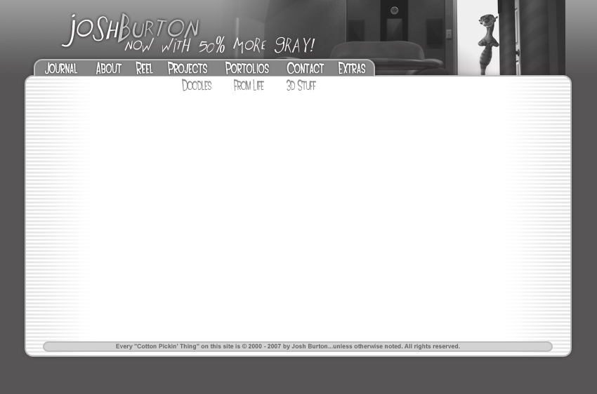 Number 3
 Number 4
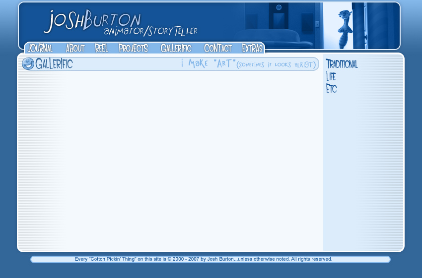
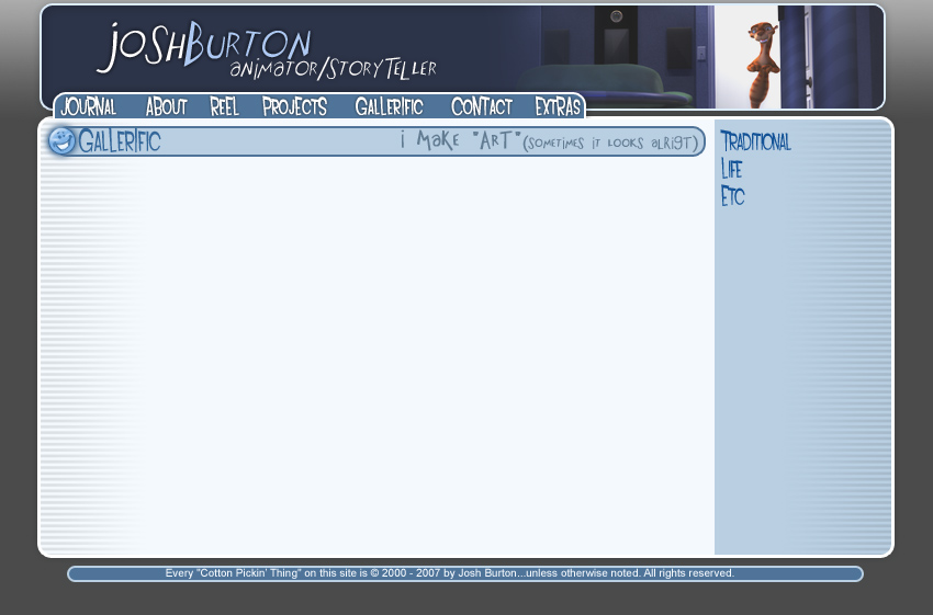 Number 5 - On a buddy's suggestion
Labels:
Concept Art
![]()

4 comments:
I like the third top banner, but I think it might go better with the blue background of the second.
I like the grey scale stuff alot. (mine is grey scale as well.) but I think color photos are the way to go. better way to show off the work.
Sucks about the loss of work. I went through the same thing about a year ago myself. (some of that stuff I am glad is gone forever.)
Post a Comment